
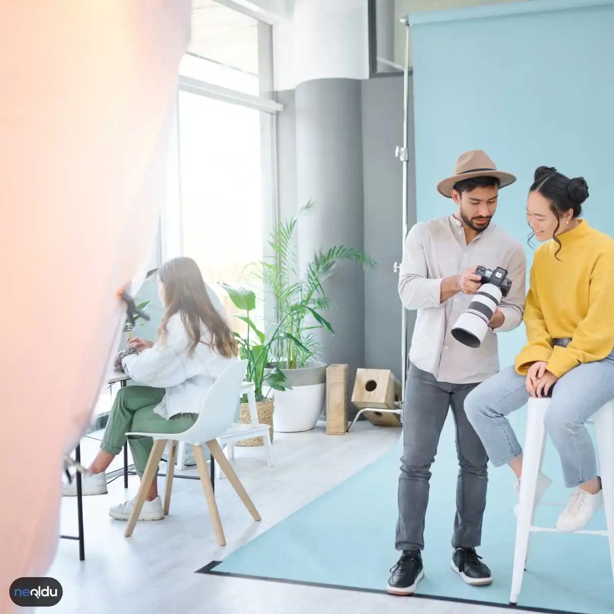
Taking photos is more about preservation than mechanical maintenance. It’s freezing time to tell a story. But can you get that shot? This requires more than just pressing the shutter. You need to work on light, composition and perspective. Color is important. Contrast is key. These factors determine the emotional weight of the image. Are you ready to take your photos out of the “snapshot” category and into the world of art? Let’s take a closer look at the basics.
The importance of light in photography
Light is the ink for writing visual stories. Without it, there is no picture. Period. However, using light correctly means more than just brightness. The important thing is direction, quality and atmosphere.
Understanding natural light sources
The sun is our most powerful tool, but also our most unpredictable. The midday sun casts harsh, unforgiving shadows. Smooth the features and wash the color away. Early morning or late afternoon (what photographers call the “golden hour”) provide soft, directional light. This light surrounds the subject, creating a sense of depth and three-dimensionality.
“Light doesn’t just illuminate, it also sculpts.”
Be careful with the angle of view when shooting outdoors. The backlight creates dramatic silhouettes and magical halo frames. The side lights emphasize the structure and shape. Front lighting is safe, but often boring. Try each one and see how it changes the story of your frame.
Controlling Artificial Light
When natural light does not help, artificial light sources intervene. But it can be difficult. A direct flash from the built-in camera is rarely satisfactory. This will give you red eyes, harsh shadows and a dull look. Instead, look for indirect sources. Bounce a flash off the ceiling and walls. Use a diffuser to soften the beam. In a studio environment, softboxes and umbrellas can help spread light evenly, reduce contrast, and create a more pleasing aesthetic.
Balancing Exposure and contrast
Light is not just something to see. It’s all about recording. Camera sensors have limitations. Too much light washes out the details. Too little and the shadows are black. It is important to learn how to balance exposure.
The role of contrast in visual impact
A high-contrast image appears. It attracts attention. Low contrast images can give people a calm, peaceful and sometimes even depressing mood. Not that one is better than the other. They have different purposes. Sharp, contrasting black and white images can convey tension and drama. Soft, low-contrast color images can evoke nostalgia and calmness.
Before changing the settings, think about what kind of atmosphere you want to convey. Do you want the object to stand out clearly against a dark background? Add contrast. Want a dreamy pastel look? Pull it back. Modern cameras and editing software make adjustments easy, but understanding the “why” behind the changes is what separates the technician from the photographer.
Composition as a guide to light
Light and composition are inseparable. You can’t fully optimize one without considering the other. The rule of thirds, leading lines and framing all affect where the light falls.
Combining perspective and light sources
Perspective changes the way people perceive light. When shooting from a low angle, the subject appears larger against the clear sky, creating a silhouette effect. Shooting from above helps minimize harsh shadows under the eyes. Play with your position
2. Frame Your Subject with Intention
Lighting creates mood. The composition tells a story. You’ll get the perfect golden glow, but if your subject hides at the edge of the frame or struggles against confusing background lines, the shot will fail. It’s not just what you see in the picture. It’s about what’s excluded.
Think of composition as a way to guide the viewer’s eye. Unstructured photos give a sense of chance. This gives the image weight. direction. purpose.
The rule of thirds is not a suggestion
Most cameras and mobile phones have a grid overlay. Turn it on. It exists for a reason.
Divide the frame into 9 equal parts using 2 horizontal lines and 2 vertical lines. Place the object along these lines or at their intersection. This off-center placement creates tension. It feels more dynamic than a static dead-center shot.
- Portraits: Place your eyes on the top horizontal line. This naturally holds your face in place.
- Landscapes: You can emphasize the sky by placing the horizon line in the bottom third row. emphasize the land by placing a horizon line on the top three lines.
Centering a subject is not wrong. It is not very attractive to the general public. Use symmetry in formal architectural images. Use the rule of thirds for everything else.
Leading Lines and Depth
Lines are invisible threads that draw the viewer into the frame. Roads, fences, rivers and even shadows can act as guiding lines. They should point toward your subject.
This technique adds depth to two-dimensional images. Without foreground and background elements, your photos will look flat.
“There’s no reason to dwell on a flat photo. Depth takes the eyes on a journey.”
Try shooting from a lower angle. Include foreground elements that are slightly out of focus. This creates a layer. Your eyes move from the blurry object in the foreground to the sharp object in the center.
Negative Space
Not all parts of the image need filled. Empty space or negative space gives the subject room to breathe. It emphasizes isolation. Or scale.
If you’re shooting a lone tree under a vast sky, make sure the tree only takes up a small part of the frame. Emptiness becomes part of the story. It creates a minimalist aesthetic that feels purposeful rather than empty.
Cropping for Impact
Sometimes the best composition comes in post-production. If you have too much headroom or there are distracting elements in the corners, you can crop it out.
However, don’t rely on cropping to fix bad photos. It starts with getting it right in the camera. Every pixel is important.
Breaking the Rules
Once these structures are understood, they can be ignored. Deliberately focusing on an object causes discomfort or improves concentration. Use extreme close-ups where you lose all context. Use chaotic lines that lead nowhere.
Rules are tools. they are not laws.
The goal is clarity. You want your viewer to know exactly where to look and what to feel. The light gives them an mood. Composition gives them a map.
Kadraj sadece neyi çektiğinizle ilgili değil. Nasıl baktığınızla da ilgilidir. Bir fotoğrafçı olarak en büyük silahınız ayakkabınızın altında kalmış olabilir. Ya da gökyüzüne bakmanız gerekebilir. Perspektif, izleyicinin sahneyi nasıl algıladığını şekillendirir. Sıradan bir manzara bile, yüksek bir açıdan veya çok aşağıdan çekildiğinde tamamen farklı bir anlam kazanır.
Düz bir açıyla çekilen bir sokak sahnesi sıkıcı olabilir. Eğer çömelir ve lensi asfalta yakınlaştırırsanız. O yamalar, su birikintileri ve gölgeler derinlik kazanır. Bu, izleyiciyi sahnenin içinde hissettirir. Yüksek bir noktadan bakmak ise kontrol hissi verir. Şehirleri kuşbakışı izlemek gibi. Bu değişim, fotoğraflarınızda dramatik bir etki yaratır.
Farklı Açıların Gücü
Standart göz yüksekliği her zaman en iyi seçenek değildir. Bunu kabul etmek zor. Bazı durumlarda yatay bir açı daha iyidir. Bazı durumlarda dikey bir açı.
- Alçak Açı: Konuyu güçlü, heybetli gösterir. Gökyüzünü arka plan olarak kullanır.
- Yüksek Açı: Konuyu küçük, kırılgan veya masum gösterebilir.
- Düzlük Açı: Doğrudan, cepheden. Doğal ve dürüst bir his verir.
Her açı bir hikaye anlatır. Hangi açıyı seçtiğiniz o hikayenin türünü belirler.
Derinlik Hissi Yaratmak
Perspektif sadece açıyla ilgili değil. Derinlikle de ilgili. Ön plan, orta plan ve arka plan arasındaki ilişkiyi yönetin. Ön plandaki bir nesneyi bulanıklaştırarak dikkati arka plana çekin. Veya ön plandaki bir nesneyi net tutarak derinlik katın.
Bu teknik, düz bir görüntüyü üç boyutlu hale getirir. Gözün sahne içinde gezinmesini sağlar. Tek bir düzlemde kalmaz. Bu, fotoğrafınızı “canlandırır”.
“Perspektif, sadece baktığınız yer değil. Gördüğünüz şeyin anlamıdır.”
Pratikte Uygulama
Bugün denemeniz gereken bir şey var. Bildiğiniz bir konuyu farklı bir açıdan çekin. Önce göğsünüz hizasından. Sonra yere çökün. Sonra bir merdivene çıkın.
Sonuçları karşılaştırın. Hangisi daha güçlü? Hangisi daha ilginç? Cevap genellikle şaşırtıcıdır. Genellikle en az bekleğiniz açı, en çok dikkat çendir.
Bu alıştırmayı yaparken, ışığı da unutmayın. Alçak açı, gün batımında uzun gölgeler yaratabilir. Yüksek açı, öğle vakti sert gölg
4. Renk ve Kontrast Kontrolü Yapın
Renk sadece süs değil. Derinlik algısını doğrudan etkileyen bir mekanizmadır. Tıpkı perspektif gibi. Ama bu sefer mekansal değil. Duyusal bir yol izler.
Sıcak tonlar öne çıkar. Soğuk tonlar geriye iter. Bu kuralı bilen fotoğrafçılar bunu bilinçli olarak kullanır. Ön plandaki bir kırmızı elbise mi? O sizi çeker. Arka plandaki mavi orman mı? O sizi içeri iter. Bu basit bir renk psikolojisi oyunu. Ama işler daha karmaşıklaşabilir.
Kontrast derinlik yaratır. Yüksek kontrast. Sert gölgeler. Bu, sahneye dramatik bir gerilim katar. Düşük kontrast ise daha yumuşak. Mistik. Havalı. Ama bazen düz ve sıkıcı olabilir. Hangisini seçeceğiniz. Anlatmak istediğiniz hikayeye bağlı.
İşte renk ve kontrastı yönetmenin pratik yolları:
- Ön planı canlı tutun. Arka planı soluklaştırın. Bu, nesnelerin birbirinden ayrılmasını sağlar.
- Sıcak-soğuk dengesi kurun. Bir tarafa sıcak, diğerine soğuk tonlar verin. Çakışma yaratarak derinlik hissi oluşturun.
- Gölge uzunluğuna dikkat edin. Düşük güneş ışığı. Uzun gölgeler. Bu, sahneye boyut ekler.
- Renk doygunluğunu ayarlayın. Aşırı doymuş renkler dikkat dağıtabilir. Kontrol altında tutun.
Renk ve kontrast kontrolü, sadece teknik bir tercih değil. Duygusal bir tercih. İzleyiciyi sahneye çeken gizli bir güç. Unutmayın. Renkler konuşur. Siz sadece dinlemeyi bilmeniz gerekir.
5. Düzenleme ve Post-Prodüksiyon Yapın
Renk paleti karar verildiğinde iş bitmiyor. Fotoğraf çekim makinesinden çıkınca ham haliyle kalmak, dijital dünyada neredeyse bir hata sayılır. Özellikle photo post-processing techniques veya daha yaygın adıyla fotoğraf düzenleme, görüntüyü düz bir kayıt halinden sanatsal bir ifadeye taşıyan aşamadır. Burası, renklerin ve kontrastın en ince detaylarına müdahale edebileceğiniz tek yer.
Gözünüzle gördüğünüz dünyayla kameranızın sensörünün kaydettiği veri arasında her zaman bir kopukluk vardır. Kameranız bazen çok sıcak, bazen çok soğuk görüntüler yakalar. İşte burada color grading basics devreye girer. Doğru aleti kullanmak, görüntünün ruhunu değiştirebilir.
Doğru Yazılımı Seçmek
Hangi photo editing software kullanacağınız, iş akışınızı ve nihai çıktının kalitesini doğrudan etkiler. Adobe Lightroom ve Photoshop endüstri standardı olmaya devam ediyor. Lightroom, özellikle renk yönetimi ve toplu düzenleme için üstün. Hızlıca ton ayarları yapabilir, doygunlukları dengeler. Photoshop ise piksel düzeyinde müdahale için vazgeçilmez. Katmanlar, maskeleme ve ileri düzey color correction tools sayesinde imajın her noktasını kontrol edersiniz.
Alternatifler de var. Capture One, profesyonel stüdyo işleri için renk tonlarını muazzam bir doğrulukla işler. Affinity Photo ise tek seferlik ödeme modeliyleLightroom alternatifi arayanlar için güçlü bir seçenek. Mobil kullanıcılar için Snapseed veya VSCO gibi uygulamalar, dışarıdayken hızlı mobile photo editing çözümleri sunar.
Temel Ayarlar: Işık ve Renk Dengesi
Düzenleme sürecine genellikle exposure and white balance ayarlarıyla başlamak en mantıklısıdır. Beyaz dengesi, görüntünün renk sıcaklığını belirler. Yanlış ayarlanmış beyaz dengesi, fotoğrafa sarımsı veya mavimsi bir filtre gibi davranır. Bunu düzeltmeden renklerle oynamak, körü körüne bir çaba olur.
Sonra kontrast ve doygunluk gelir. Contrast and saturation controls görseli canlandırır ama abartıya kaçmak görüntüyü yapay hale getirir. Aşırı doygunluk, ten renklerini turuncu tonlara sürükleyebilir. Doğanın güzelliğini yansıtan bir görüntüde, renklerin doğal durması her zaman daha etkili sonuç verir.
İleri Seviye Teknikler: Renk Ayrıştırma
Profesyonel görünümü yakalamanın sırrı, color separation techniques olarak bilinen aşamada yatar. Bu teknik, görüntünün belirli renk bölgelerini (örneğin gölgeler, orta tonlar, parlaklar) ayrı ayrı düzenlemeyi sağlar. Örneğin, gölgeleri hafif maviye, parlakları ise
Düzenleme ve post-prodüksiyon, fotoğraflarınızın final dokunuşunu yapmanın önemli bir parçasıdır. Bu aşamada, çektiğiniz fotoğrafları daha da geliştirmek, hikayeyi güçlendirmek ve istediğiniz atmosferi yaratmak için çeşitli araçları kullanabilirsiniz. İşte düzenleme ve post-prodüksiyon sürecinde dikkate almanız gereken bazı önemli noktalar:
Fotoğraf Düzenleme Yazılımı Seçimi
İyi bir fotoğraf düzenleme yazılımı kullanmanız, fotoğraflarınızı etkili bir şekilde düzenlemenize yardımcı olur. Adobe Photoshop ve Lightroom, popüler ve güçlü düzenleme araçları sunan önde gelen programlardır. Bu yazılımlar, renk düzenlemesi, keskinlik ayarı, kontrast ayarı ve perspektif düzeltme gibi birçok işlemi yapmanızı sağlar.
Pozlama Ayarları
Pozlama, fotoğraflarınızın parlaklık düzeyini belirler. Fotoğrafınızın doğru pozlanması, nesnelerin ayrıntılarını ve renkleri doğru bir şekilde göstermenizi sağlar. Pozlama düzenlemeleriyle, fotoğraflarınızdaki parlaklık ve gölgeler arasındaki dengeyi ayarlayabilirsiniz.
Renk Düzenlemeleri
Renk düzenlemeleri, fotoğraflarınıza istediğiniz atmosferi katmanın önemli bir yoludur. Renk tonları, doygunluk, beyaz dengesi ve renk düzeltmeleri gibi araçlarla fotoğraflarınızdaki renkleri değiştirebilirsiniz. Bu sayede, fotoğrafınızın duygusal etkisini ve görsel cazibesini artırabilirsiniz.
Keskinlik ve Detay Ayarları
Fotoğraf düzenleme yazılımları, fotoğraflarınızdaki keskinlik ve detayları artırmanıza yardımcı olur. Özellikle portre fotoğraflarında yüz hatlarını belirginleştirmek veya manzara fotoğraflarında ayrıntıları vurgulamak için bu araçları kullanabilirsiniz.
Kırpma ve Kompozisyon
Fotoğrafınızın kompozisyonunu düzenleyerek odak noktalarını vurgulayabilir ve istenmeyen unsurları çıkarabilirsiniz. Ayrıca, fotoğrafı kırpma aracılığıyla farklı en-boy oranlarına uygun hale getirebilirsiniz
Doğa ve Manzara Fotoğrafçılığı İpuçları
Light and time
Light is everything in all landscape photography. Avoid midday sun. It is harsh and flat. Instead, wait for the golden hours. Dawn and dusk provide soft, directional light. An ordinary scene becomes dramatic. Shadows lengthen. The colors are saturated. You can get a ethereal glow. Think about what you want to capture. A sunrise requires a different settings than a storm.
Composition Rules
Don’t just point and shoot. Frame your shot. The rule of thirds is a good start. Divide the frame into a grid. Place key elements along these lines or at their intersections. If you are shooting a coastline, place the horizon line on the top third line. Place the bottom two-thirds in water or sand. Add depth. Place the foreground element in the frame. A rock. A tree. It gives the viewer a place to enter the picture. Without this, your photos will look boring.
Gear Essentials
A wide angle lens can help. They capture the vastness. But stability is more important. Use a tripod. Long exposures in low light can cause the images to be out of focus if the camera moves. Using a tripod can help keep things sharp. Filters can also be useful. Polarizers can reduce glare. Neutral density filters darken the scene for long exposures. They allow you to control the elements of nature.
Capturing Motion
Stillness is not necessarily the goal. Show movement. If the shutter speed is long, the waterfall will look misty. It is very smooth. Ethereal. Grass swaying in the wind gives vitality. It freezes for a moment, but it also shows the passage of time. This is a choice. Do you want stillness? Or a flow?
Introduction to portrait photography
Portraits are different. Here, the subject is the story. The context is important, but it should support the person, not the other way around.
Building trusting relationships, not just taking photos
Portrait photography is more than photographing faces. It’s about capturing individuality. The goal is to emphasize the model’s natural beauty and personality. This can be achieved by making the target feel safe.
Please talk to them. Make them laugh. Create a relaxing atmosphere. When the model feels comfortable, the expressions become more realistic. Capture fleeting candid moments instead of rigid poses. Connection always wins over technical perfection.
Control the light and background
Light sets the mood. Soft natural light is a great ally in portrait photography. Avoid strong sunlight during the day. Instead, shoot during the golden hours or find an open, shady spot. If the sun is too bright, use reflectors or diffusers to soften the light. You can control the direction and quality of the light with simple tools.
The background defines the scene. A messy background distracts your subject. Choose a simple, clean background to draw attention to the person. Do you want to distinguish your model from the environment? Use a wide aperture (low F-number). The depth of field becomes shallow, the background blurs and the subject stands out.
Focus on the eyes
In a portrait, the eyes are the anchor. They convey feelings and connection. Ensure they are tack-sharp. lock onto the eyes using single-point autofocus or manual focus. If both eyes are in the picture, focus the camera on the closest eye. Blurred eyes can ruin your portrait. Clear expressive eyes save it.
Composition and framing
The rule of thirds is classic for a reason. Place key elements along grid lines or intersections. It creates balance. Don’t be afraid to try different angles. A low angle can make the subject look more impressive. High angles can create a sense of closeness. Change your perspective and add interest.
Choose the right equipment
Not all cameras are created equal. Beginners should consider an entry-level DSLR or mirrorless camera. They are tolerant and easy to learn. Experienced shooters can opt for higher-quality bodies with better low-light performance and faster autofocus speeds. Consider your budget and portability. You don’t need the most expensive kit to take great photos. You have to know how to use what you have.
Edit and settings
Software is not as important as skills. Adobe Photoshop and Lightroom are industry standards. If that’s out of your budget, try free options like GIMP or online tools like Pixlr. The best software is the one you know how to use effectively.
When shooting or learning, start in automatic mode. But don’t stay there forever. Try using aperture priority (Av/A) to adjust the depth of field. Try shutter priority (Tv/S) for motion. Finally, proceed to the manual (M). Understanding the exposure triangle gives you complete creative control. Test different modes to find your style.