



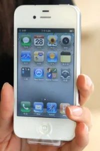
It arrived in the spring of 2011. Crisp. Clean. Unapologetically white.
The iPhone 4 in white wasn’t just another color option. It was a statement. Apple had dominated the black phone market for years, and suddenly, they flipped the script. The front faced glass, the back faced glass, and the whole thing looked like a slab of premium material you didn’t want to drop. Which, ironically, was the main complaint. But sales? They didn’t care.
This device remains one of the most popular cell phones ever made. It cemented Apple’s status. It set the template for every smartphone that followed. The camera got better. The screen got sharper. The design got bolder.
If you’re wondering how this specific model fits into the broader history of mobile tech, it’s a pivotal moment. It proved people would pay for aesthetics as much as specs.
Check the next pages to see how other historic phones stacked up against this giant.
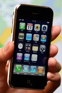

Why the iPhone 3 still matters in 2008 hardware comparisons
Look at an iPhone 3 from 2008. It’s ancient now. Back then, it was the thing. But let’s be real about the specs. The talk time? Short. The camera? Grainy at best. It was a revolutionary device with distinctly first-gen limitations. You got the experience, sure, but you traded battery life and photo clarity for the privilege of holding the future in your palm. It defined the smartphone era, even if it couldn’t survive a full day of heavy use or capture a sharp sunset.
The Sony Xperia Play: Android’s failed gaming experiment
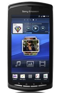
Then there’s the Sony Xperia Play. A different beast entirely. It launched with a 4-inch touch-screen display and ran on the Android OS. Sony didn’t just want another phone. They wanted a handheld gaming console that happened to make calls.
The gimmick? A slide-out physical control pad. You’d swipe the bottom of the device up to reveal D-pads and shoulder buttons. It looked cool. It felt like a PSP fused with a smartphone. The idea was to bridge the gap between mobile gaming and dedicated consoles.
Did it work? Not really. The screen size was a compromise. Too big for comfortable one-handed gaming, too small for immersive console-like experiences. The control pad added bulk and complexity. Android gaming wasn’t quite ready for hardware buttons either; most games were optimized for touch.
It’s a fascinating footnote in tech history. A bold attempt to merge two worlds that weren’t quite ready to merge. The Xperia Play reminds us that form factor matters. You can’t just slap buttons on a touchscreen and call it a gaming device. The software ecosystem has to catch up. Sony learned that lesson the hard way.
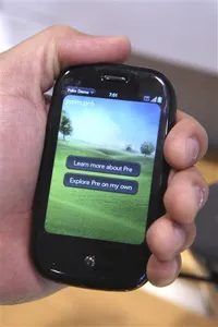
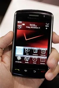
The Pre and the Storm: A Clash of Titans
Palm didn’t just tweak their software. They built the Palm Pre on a Linux-based mobile operating system. It’s a detail that matters more than most realize. Linux under the hood meant stability. It meant speed. It meant the device could handle tasks without choking.
The hardware followed suit. A full QWERTY keyboard sat next to a responsive touchscreen. You could type fast. You could touch with precision. It wasn’t one or the other. It was both. A hybrid approach that felt familiar yet fresh.
The Palm Pre used a Linux-based mobile operating system with a full QWERTY keyboard and touchscreen.
Then there was RIM. Research in Motion had a reputation. The BlackBerry was the king of email. The king of business. But the iPhone changed the game. Suddenly, touch mattered.
RIM responded with the BlackBerry Storm. It was their first touchscreen phone. A direct answer to Apple. A competitor built to fight back. But this was RIM trying to walk a new path. One they hadn’t mastered yet.
Why the OS Matters
The difference between the two phones wasn’t just the screen. It was the brain inside. The Pre’s Linux foundation allowed for smoother multitasking. Apps didn’t freeze as often. The interface felt lighter.
The Storm tried to bring that same magic to the BlackBerry ecosystem. But it struggled. The hardware and software didn’t quite sync up. The touchscreen lagged. Users tapped harder. Harder still. Frustration set in.
Which phone had the better foundation? The Pre did. Its Linux base gave it an edge in performance. The Storm was a brave attempt. A necessary one. But it lacked the polish. The speed. The confidence.
The Legacy of the Touchscreen Shift
Both phones represented a pivot. Palm moved from command centers to smartphones. RIM moved from keyboards to touch. The market demanded it. Apple forced the issue.
The Pre showed what a Linux-based mobile OS could do. It was fast. It was capable. It paved the way for future devices. The Storm showed the risks. Trying to catch up is hard. Especially when you’re changing your core identity.
Users wanted responsiveness. They wanted reliability. The Pre delivered on many fronts. The Storm tried. It failed to convince many.
The era of the QWERTY-only phone was ending. The touchscreen was here to stay. But not all touchscreens were created equal. The OS behind it made all the difference.

Windows Mobile vs Android: The 2009 Pivot
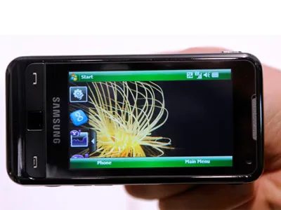
The Samsung Omnia didn’t just run Windows Mobile Professional 6.1. It ran a specific, dated slice of enterprise history. That OS allowed users to open mobile versions of Word, PowerPoint, and Excel. Sounds useful. It was. For a moment. You could actually edit documents on a phone screen that felt more like a calculator with ambitions than a modern tablet.
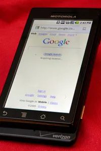
Then came the other side of the coin. 2009. The year Android stopped being a rumor and started being everywhere. It landed on several phones, most notably the Droid. Suddenly the landscape shifted. You had one camp sticking to the Microsoft ecosystem with its familiar office suite shortcuts, and another camp embracing a new, open standard that promised something different.
Which path did you choose? The familiar friction of Windows Mobile or the raw potential of an Android system still finding its footing? The answer depended on whether you cared more about typing an Excel spreadsheet or having a phone that didn’t feel like a pocket computer from 2005.

The Droid didn’t kill the iPhone, but it forced a reaction
People love to talk about the Droid like it single-handedly ended the iPhone’s reign. It didn’t. Not even close. But it did something arguably more important: it forced Apple to sweat.
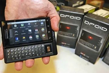
The original Droid, released by Motorola in 2009, was a direct challenge. It had a touchscreen, sure. But it also kept a physical slider keyboard. That was the killer feature for users who hated typing on glass. It offered a 5-megapixel camera, which was decent for the time, and it ran on a platform that felt open compared to Apple’s walled garden.
What actually made the HTC G1 special?
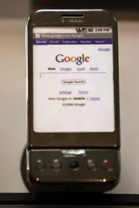
Before the Droid existed, there was the HTC Dream. Known as the HTC G1, this device is the real ancestor of modern Android.
It was the first phone to launch with the Google Android OS. Before this, smartphones were dominated by BlackBerry, Windows Mobile, and Symbian. Android was the new kid.
There’s a catch, though. Android isn’t just software. It’s an identity. To use the phone, you have to link a Google account. No Gmail? No Google. This wasn’t a choice you could skip during setup. It tied your entire digital life to Google’s ecosystem from day one.
The HTC G1 proved that a touchscreen phone could work without a stylus. It also proved that Google could build an OS.
So, while the Droid got the marketing buzz, the G1 laid the tracks. The Droid just drove a faster car down them.
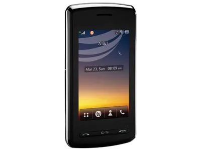

How AT&T Mobile TV turns your LG Vu into a portable screen
Flip the LG Vu on its side. The portrait layout shifts. Suddenly you’re holding a mini widescreen television.
It’s not just a clever UI trick. The device supports AT&T Mobile TV, a live broadcast service that beams video directly to your handset. No buffering loops. No streaming app loading screens. Just raw broadcast signal hitting your display.
Why does this matter? Because it changes how you consume media on the go. You aren’t waiting for a buffer bar to fill. You’re watching live feeds as they happen. Turn the phone sideways and the aspect ratio snaps into place. It feels less like checking an app and more like tuning a channel.
The integration is tight. You don’t hunt for a separate player. You just orient the device. The screen adjusts. The broadcast starts. It’s one of those hardware-software synergies that actually works instead of feeling like an afterthought.
The LG Vu supports AT&T Mobile TV, a live mobile broadcast service sent straight to the phone.
This isn’t generic streaming. It’s a specific broadcast tier. If you’re on AT&T, the Vu unlocks this capability natively. Other phones might need third-party apps or data-heavy workarounds. This is built in.
Does it replace your tablet? No. But for quick hits of live content while commuting? It’s surprisingly effective. The widescreen mode makes it watchable. The broadcast nature makes it immediate.
You just have to remember to rotate the phone. Once you do, the Vu stops being just a phone. For a few minutes, it’s a TV.

The slide-out keyboard made a comeback, then vanished again
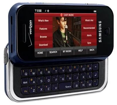
Remember the Samsung Glyde? It had that satisfying mechanical clunk when you slid the QWERTY keyboard out. Physical keys. Tactile feedback. It felt like typing on a real device.
Samsung killed it.
They replaced it with the Samsung Rogue. Same concept. Slide-out keyboard. But the momentum died there. The market shifted toward touchscreens. Big ones. Edge-to-edge glass. The idea of a hidden keyboard under a capacitive screen seemed clever in 2011. Now it just feels like a compromise. You lose screen real estate for keys you barely use. Or maybe you miss the keys. Which is it?
Hitachi’s W62H pushed OLED limits early on
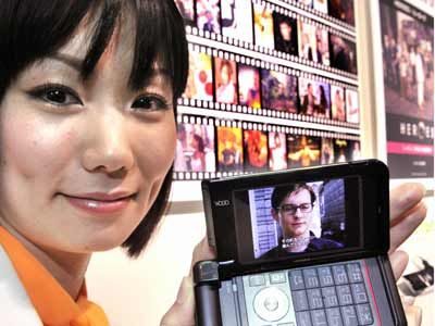
Over in Japan, KDDI was showing off something else. The Hitachi W62H.
It wasn’t about typing. It was about watching.
This phone featured an OLED display capable of playing downloaded movies. OLED was still niche then. Most phones ran LCDs. They were brighter, cheaper, and easier to manufacture at scale. OLED had better contrast. Deeper blacks. But it was tricky to produce. Hitachi bet on it for media consumption.
The W62H proved that mobile screens could be cinema-grade, not just information panels.
KDDI employees displayed it proudly. An employee held it up for the cameras. It was a statement piece. A media player disguised as a phone.
Why does this matter? Because it foreshadowed the current war on screen quality. Every flagship today brags about OLED. High refresh rates. HDR support. We take it for granted now. Back then, playing a downloaded movie on a phone screen was a flex. The pixels mattered. The color accuracy mattered.
Hitachi didn’t make it big in the global smartphone race. But they got the vision right. The screen is the interface. If the image sucks, the hardware underneath doesn’t matter.
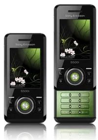

The s500i’s seasonal glow
Sony Ericsson took the ambient light sensor concept and ran with it. The s500i didn’t just detect light levels to adjust screen brightness. It mapped them to seasons.
Spring, summer, fall, winter. The phone cycled through these automatically. The backlight on the buttons shifted color to match. Green for spring. Warm tones for fall. It felt less like a utility feature and more like a mood ring for your pocket.
You didn’t have to toggle anything. The phone watched the light around it and decided what season it was. The result? Your keypad glowed in a way that matched the outside world.
It sounds gimmicky. Maybe it was. But at the time, it showed how far manufacturers were willing to go for context-aware UI design. The hardware was simple. An optical sensor. But the software tied it to a calendar and a color palette.
Did anyone actually care about button colors matching the solstice? Probably not. But it was a clever trick. A reminder that early 2000s mobile tech was all about making devices feel alive. The s500i breathed with the seasons.


The sliding door era and the twist-to-shoot camera
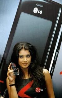
LG didn’t just make phones. They made jewelry that happened to take calls.
The Chocolate series was their crown jewel. It started as a slider. Sleek, candy-bar shaped, with a keypad that slid out from under a glossy screen. It felt expensive. It sounded expensive. But LG kept tinkering. The design shifted. The slider mechanism vanished, replaced by a resistive touchscreen. They shoved a dedicated music player into the hardware, trying to eat into the iPod’s lunch.
It was a mess of iterations. One year it was a slider, the next it was a touch interface, then a hybrid. The core promise remained the same: small, flat, and obsessively stylized.
“Design is the final arbiter of quality.”
Samsung took a different route. They looked at the camera module on the back of every phone and thought: what if we moved it?
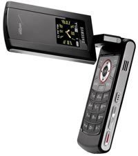
Enter the Flipshot.
It wasn’t a slider. It wasn’t a touchscreen gimmick. It was a mechanical puzzle. You flipped the phone open. Then you twisted the top half 90 degrees. Suddenly, the rear-facing camera was facing forward. The phone had just turned into a point-and-shoot camera.
No app needed. No software lag. Just physical movement.
It mattered because it acknowledged a simple truth: people wanted to take photos with their phones, not just store them. The Flipshot made the hardware serve the camera, rather than the camera serving the hardware. It was clunky. Yes. But it was intentional.
Which approach worked better?
The Chocolate’s touchscreen eventually felt dated as capacitive screens took over. The Flipshot’s mechanical twist was a novelty that didn’t scale. Neither defined the industry. But both showed that before the screen became the entire interface, manufacturers were still playing with form factors. They were still trying to figure out what a phone was.
Was it a communicator? A camera? A music box?
They tried to make it all three. At the same time. With sliding parts and twisting hinges.
It didn’t last. But for a moment, your phone was a piece of kinetic art.

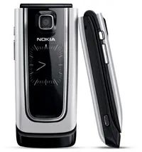

Why the Nokia 6555’s display still holds up
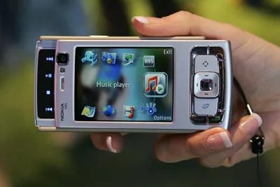
Most phones from that era looked like they were viewing the world through a tinted window. The Nokia 6555 didn’t. It pushed out 16 million colors. That number sounds abstract until you remember what the competition was offering. Usually, it was 65,536. Sometimes less.
This wasn’t just a spec sheet flex. It meant gradients actually looked like gradients. Photos retained their depth. The screen became a window rather than a filter.
Video calls before they were cool
Look to the upper left of the screen. There’s a camera. Not a rear shooter for Instagram snaps. A front-facing lens.
Back in 2007, this was niche tech. You didn’t need it for selfies. You needed it for video conferencing. The Nokia 6555 let you see the person you were calling. Face-to-face, over a cellular network. It felt like a trick. It worked, though.
Was it the first? Maybe not. Was it one of the most accessible devices to do it? Absolutely. It turned a business feature into something a regular user could touch and use. No desktop PC required. No bulky headset. Just flip the phone open, tap a button, and be seen.
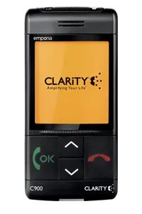
Why the Clarity C900 actually works for seniors who hate smartphones
You know the type. People who actively avoid cell phones because they’re afraid of poking their eyes out with a touchscreen. For them, the Clarity C900 isn’t just a phone. It’s a compromise that actually holds up.
It strips away the digital noise. No apps. No confusing menus. Just an oversized screen that makes everything visible without squinting. The large fonts aren’t an afterthought either. They’re built into the interface, meaning you don’t have to fiddle with settings just to read a text.
Then there are the simple buttons. Physical. Tactile. You can feel them. This matters more than you’d think when your thumbs aren’t what they used to be or when you just want to make a call without navigating three sub-menus first.
The design choices here prioritize clarity over complexity, which is exactly what the target demographic needs.
It’s not fancy. It doesn’t need to be. For someone who just wants to stay connected without the stress, the Clarity C900 hits the right notes. Big screen. Big text. Real buttons. That’s it.
Wearable skins and silent screens
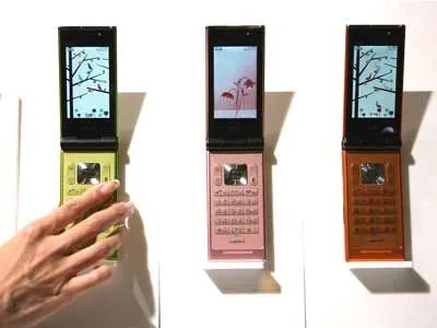
Sony Ericsson had a different idea about personalization. They didn’t just want you to pick a color. They wanted you to strip the phone down and rebuild it. Their Full-Change Mobile re series let users swap out every surface. The front, the back, the sides. You could match your outfit. Or your mood. It was hardware-level customization in an era when software skins were just becoming a thing.
Most of us stuck with the original casing. It was easier. But the concept stuck. It asked a question we still ask today. Why can’t I change how my device feels?
Sign language gets a 3D upgrade
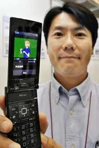
Hitachi went in a completely different direction. Accessibility. They showed off a prototype that used 3D animation to display sign language. Not static images. Not text captions. Actual animated hands moving in three dimensions.
It matters because sign language is visual and spatial. Flat text loses nuance. A 2D video might hide the depth of a gesture. 3D animation restores that context. It allows a deaf user to read signs from any angle. The technology isn’t mainstream yet. But it points toward a future where devices speak every language. Including the ones we see but don’t hear.
How the fuel cell prototype actually charges your phone
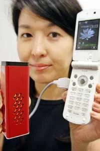
NTT DoCoMo employee Tomoko Tsuda holds up the working prototype. It’s a polymer electrolyte fuel cell (PEFC) battery. Not a standard lithium-ion pack. This device does something specific. It charges the mobile phone’s existing lithium-ion battery.
The distinction matters. Most phones rely purely on chemical storage. This setup uses fuel cell technology to generate power for that storage. Tsuda displays the model to show how the conversion works. The PEFC unit acts as a generator. It feeds energy directly into the phone’s internal battery.
Why use a fuel cell? Efficiency. Range. The source article focuses on this physical demonstration. It’s not just a concept drawing. Tsuda is showing the hardware that bridges the gap between fuel and digital power. The lithium-ion battery still exists inside the phone. It still handles the immediate load. But the PEFC extends the life of that charge.
This changes how you think about battery life. You aren’t just waiting for a wall outlet. You’re looking at a system that replenishes itself differently. The prototype proves the connection is viable. Tsuda’s display is the key evidence. It’s a tangible link between advanced energy tech and the device in your pocket.

The original push-to-talk hardware
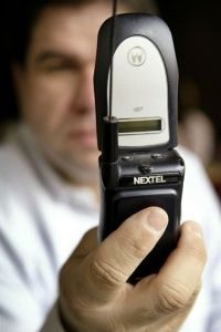
Nextel didn’t just invent a feature. They built a phone that felt like a walkie-talkie. In 2003 they launched the first push-to-talk devices. It changed how people talked to each other. No dialing. No ringing. Just press and speak.
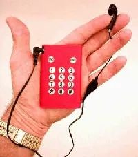
This specific disposable unit is different. It’s not for group chats. It’s for one-way communication. You can only send outgoing messages. There is no incoming capability. That limitation is the point. You stay invisible to the caller.
The runtime is strict. 60 minutes of calling time. That’s it. When the clock hits zero the phone dies. You don’t recharge it. You don’t top it up. You throw it away.
Why use it?
Sometimes you need a line that disappears. Burner phones are nothing new. But this one removes the risk of incoming contact entirely. It’s a tool for privacy. Or maybe just for simplicity.
Technology that expires on purpose is rare. Most devices are designed to last. This one is designed to end.
It’s a stark contrast to the modern smartphone. We carry servers in our pockets now. We want forever connectivity. This device offers a finite window. Sixty minutes. Then silence.
The 2003 Nextel launch started a trend of instant voice. This disposable model ends with a cliff. No buffer. No grace period.
Which fits your needs?
If you need to receive calls you’re out of luck. If you need to make a few urgent calls and vanish this works. It’s a niche tool. But niches exist for a reason.
The hardware is basic. Probably a low-end GSM chip. A small battery. A plastic shell. Nothing fancy. The software is likely locked down tight. No apps. No browsing. Just voice.
Is it worth the hassle?
Maybe. If you value anonymity over convenience. If you prefer a phone that doesn’t ping you with notifications. If you want to control the exact moment communication stops.
It’s a radical idea in an era of constant connection. To stop talking on your own terms. To have a device that agrees with you when it’s done.
You hold the power. For an hour.

The lingering ghost of the BlackBerry ecosystem
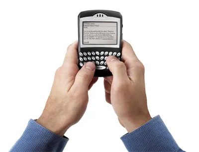
It launched in 1999. That puts it squarely in the late-90s tech boom. At the time, the BlackBerry didn’t just have an OS. It had a proprietary operating system that actually let third parties build things for it.
Most people assume the platform died with the hardware. They’re wrong.
Developers are still out there. They’re still designing apps for the BlackBerry platform. It’s a niche, sure. A tiny, stubborn sliver of the internet. But the code is running. The support exists. And for some reason, the ecosystem refuses to fully flatline.
Why keep building for a dead phone? Because the software layer persists long after the hardware stops shipping.
It’s not about selling millions of devices. It’s about the architecture. The proprietary OS allowed for a level of customization and integration that modern walled gardens sometimes struggle to match. Some developers prefer the constraints. Others just like the challenge.
The result is a living museum of mobile development. You won’t find the latest hyped app here. You’ll find utilities. Tools. Things that work quietly in the background.
It matters because it proves platforms aren’t binary. They’re not just “alive” or “dead.” They fade. They linger. They become specialized. The BlackBerry OS is still a valid target for third-party applications. That’s a fact. Not a rumor.
The hardware is gone. The soul of the software remains.
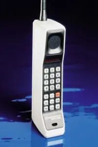
The AMPS Standard and the Birth of Analog
The whole thing started in 1983. That was the year the FCC gave the green light to the AMPS standard. Suddenly, analog cell phones had a place to exist.
It feels distant now. We’re used to 5G and glass slabs that do everything. But AMPS was the foundation. It defined how early mobile networks actually functioned.
One of the originals: Analog cell phones were born in 1983 when the FCC approved the AMPS standard.
If you want to dig into the mechanics of it all, checking out How Cell Phones Work helps contextualize the shift. It’s not just about talking on a brick-sized device anymore. It’s about the infrastructure that made it possible.
The history of cell phones isn’t a straight line. It’s a series of approvals, standards, and technological leaps. AMPS was the first big leap.


